Introduction
The Divi Visual Builder is what we use to create our content for pages in a live front-end view. We use this for any page listed in the Pages menu and for page templates we have prepared in the Theme Builder.
Let the page content load fully, it may take a few seconds to render our Guestwisely plugin modules.
Please note: Some modules that are linked to the property API may display differently to the front-end live site and this can be ignored.
To enter the Visual Builder we must go to Pages Menu > Select Page > Edit With the Divi Builder.
Section Types
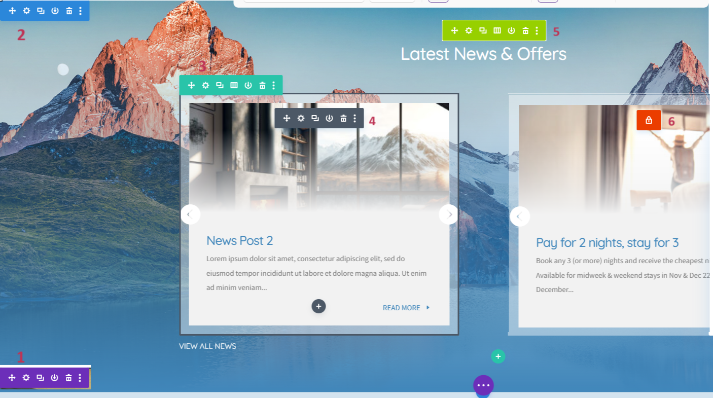
Toolbars
All the above sections have the same toolbar on mouse-over.
Move – Drag your section
Settings – Content, formatting and styling configuration
Duplicate – Make a copy of section
Save Section – Save section to Divi Library
Delete – Remove section
Settings will be mostly heavily used, which is split into 3 tabs of Content, Design and Advanced. You may visit the Design tab for initial setup of styling but Content will be the go-to place for add/editing your website text and images.
Settings will be mostly heavily used, which is split into 3 tabs of Content, Design and Advanced. You may visit the Design tab for initial setup of styling but Content will be the go-to place for add/editing your website text and images.
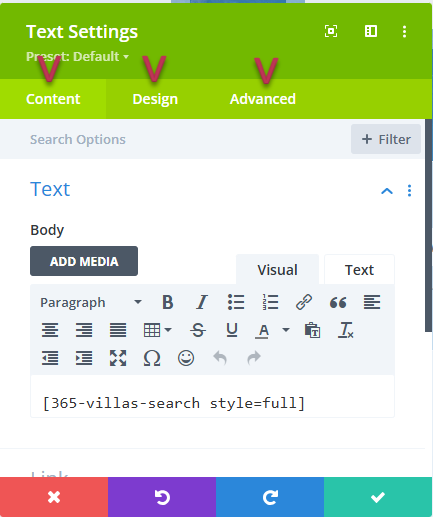
Important: Always remember to confirm changes made with the green tick (or ignore them with the red close) or your edit will revert back. This does NOT save the page yet, see below.
Menus
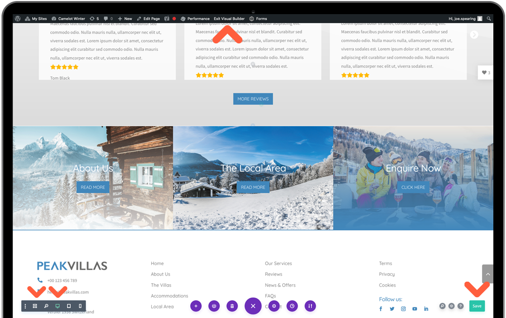
Wireframe View: This is an alternative view of the page to the live view of the visual builder. It shows a section view of what we have covered above, color-coded and labelled for clarity. We recommend using this in some intricate edits, covered later in the tutorials.
Device Previews: These 3 device icons will allow you to preview your webpage on three default device sizes of desktop, tablet and mobile. Once you enter the tablet view you will also be presented with a dropdown list of device models for more detailed inspection.
Save Button: Always remember to save changes! You may need to be a little patient at times and allow the button to stop spinning and display the tick icon.
Exit Visual Builder: This can be done from the WordPress topbar. If you wish to leave and visit the current live page, click Exit Visual Builder. Or to go back to your WordPress CMS click Dashboard from the top-left dropdown.
Site Logo
Head to the main Divi Menu and you will see at the top of the General settings is the Logo Upload. This will take you to your media library where you can drag your logo file in from your desktop. It will be added to your main menu header and your custom 404 page. ‘Save Changes’ at the bottom of the page.
Design Tips: Be sure to use a version of your logo that stands out well on the navigation section. PNG or JPG format will be suitable – just try to make sure your logo is cropped to its edges to make the most of its size.
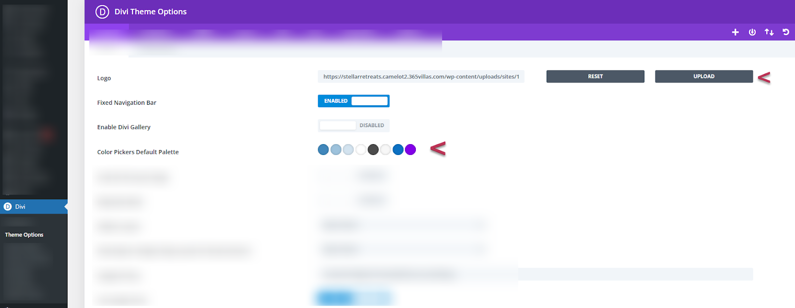
Color Palette: A little further down from Logo you will see a default colour palette. These will pull through to the Divi Page Builder for every setting you have for editing – making it a much quicker process for updating your template theme. These will also link with your global colour which we will set later, that updates the whole website.
Work your way through, clicking each of the default colours and enter your own 6-symbol hex code taken from your brand colours.
Design Tips: There will likely be only 2 or 3 colours in your brand but including some tints of your primary colours will help you style the pages. You can order these in the palette however you please but try to keep in mind which will be the main highlighting colour of the website. Don’t know your hex codes? Click here.
Header & Footer
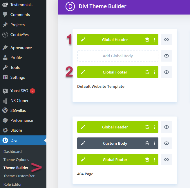
Go to Divi Menu > Theme Builder.
The first container stores the templates that are used as default on every webpage – we call this our global templates. Click the edit icon on either the green global header or footer bars to open the Divi Visual Builder.
Tip: Open the Wireframe View via the grid icon in the bottom Visual Builder Menu. We have multiple sections in a small area so can be confusing to edit in the live view.
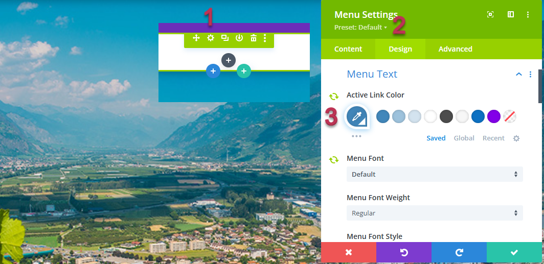
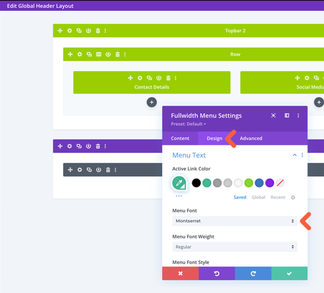
1. Global Header
The header has already had the logo and button formatted from previous steps, so all that is left to do here, should you want to, is change the font of the menu to either your header or paragraph font Design > Menu Text > Menu Font > Save.
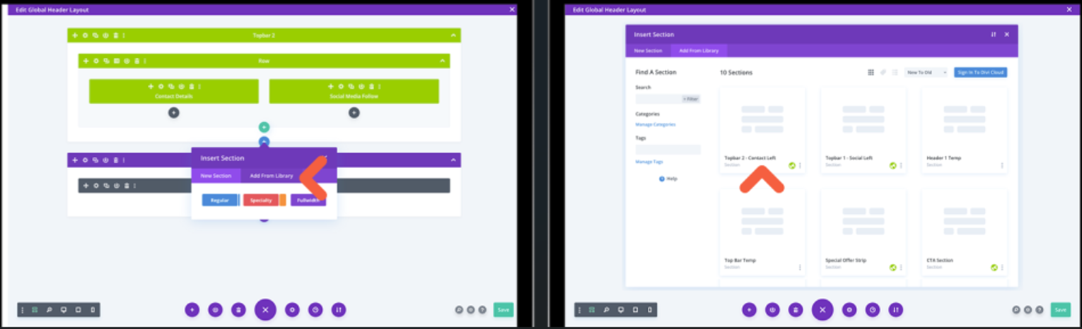
Toolbar 2 - There is an alternative Topbar you may use if you are not active on social media. Simply click the blue (section) plus icon, ‘Add from Library’ tab and select Topbar 2 – ‘Use this layout’ button. This uses a Text module for you to display Tel, Email and/or address. Delete the existing Topbar 1 with the trash icon in the the toolbar menu.
Main Header – this has already had the logo and buttons formatted from previous steps, so all that is left to do, should you want to, is change the font of the menu to either your header or paragraph font Design > Menu Text > Menu Font.
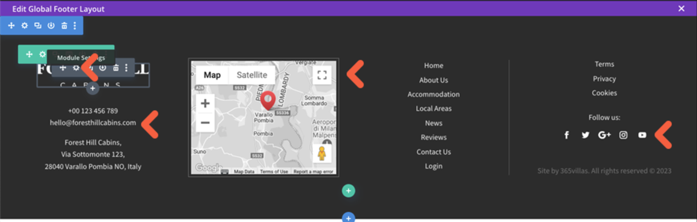
2. Global Footer
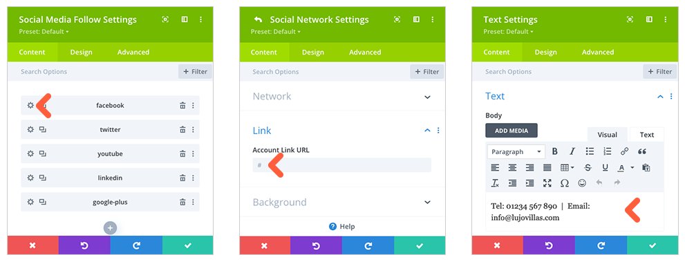
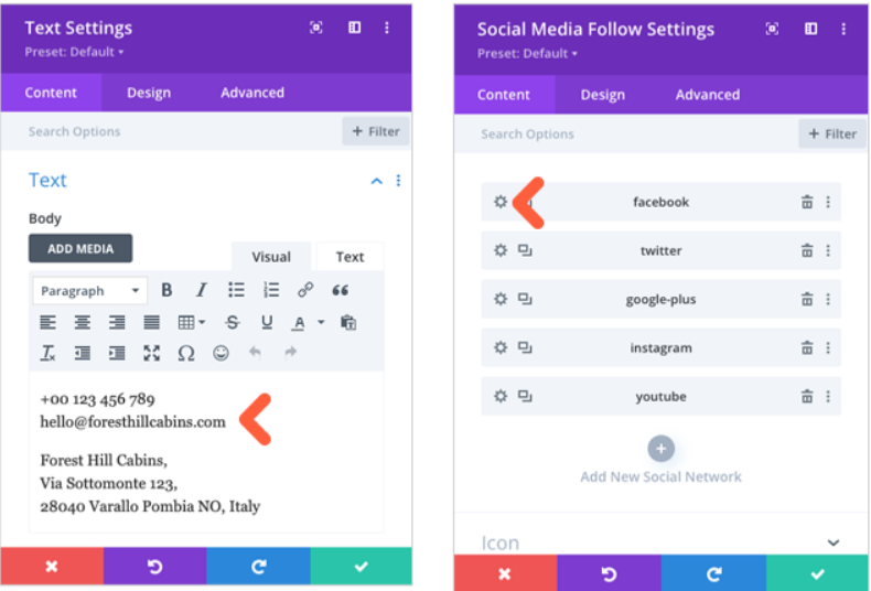
Enter the footer via the Edit icon where you will make a few small edits to your company information. The footer logo is also connected to the Site logo settings so no changes needed. Make your way through each grey module editing Tel, Email, Address and Social Media as shown below. The Menu items are controlled in WordPress CMS later, should you need to update.
Enter the global footer via the Edit icon where you will make a few small edits to your company information, map and social media links. The footer logo is also connected to the Site logo settings but if you have changed the footer background color and need a new version of the logo to stand out, you can change this via the module settings. Make your way through each grey module editing Logo, Tel, Email, Address and Social Media using the module instructions in Creating Page Content. The Menu structure is also controlled in WordPress CMS (covered later in the tutorial), should you need to.
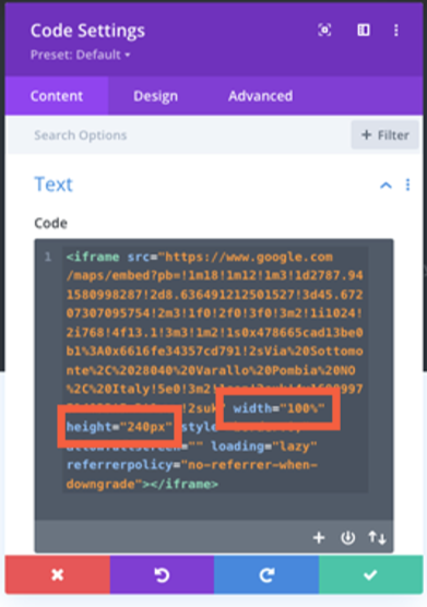
For the footer map you will need to insert an embedded map from google maps rather than using the Divi map module. This is because the footer appears on every page of the website and the google map api cannot be used for 2 instances on the same page when it is also needed, for example,on individual property listings. To insert an embedded map, visit Google Maps and insert your address. Click ‘Share’, in the popup select ‘Embed a map’ tab and then ‘COPY HTML’.
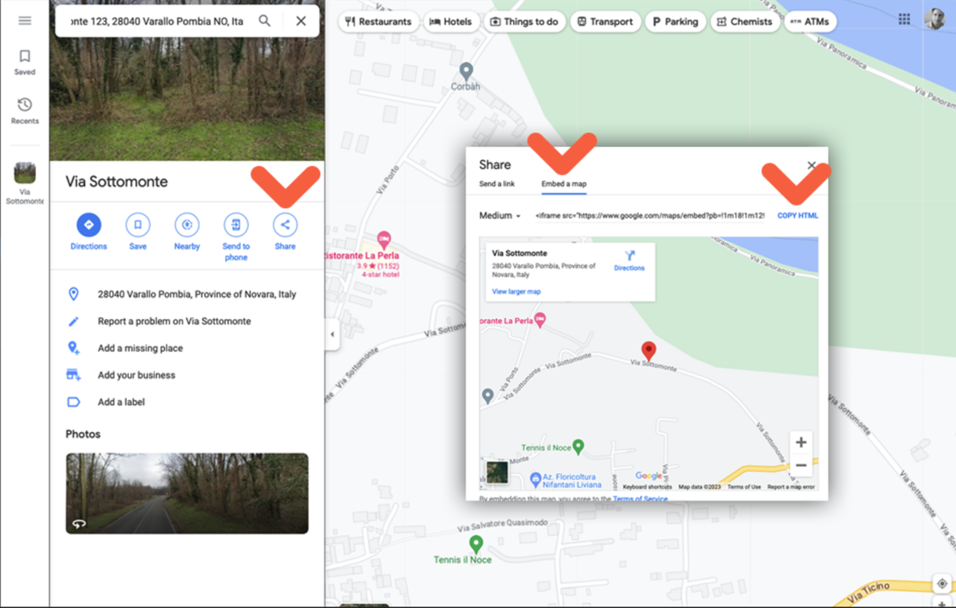
Paste the HTML into your code module. Two of the default dimensions will need updating in the code for the width (to 100%) and the height (to 240px). Save changes to the footer layout.
Was this article helpful?
That’s Great!
Thank you for your feedback
Sorry! We couldn't be helpful
Thank you for your feedback
Feedback sent
We appreciate your effort and will try to fix the article