Introduction
GuestWisely WordPress Themes integrate with Divi to create and manage your page branding, website templates and page content. It also assists with integrating our own WordPress plugin, to generate our booking modules via short codes.
Theme Options
Visit Divi Menu > Theme Options. Most of the settings are all correctly in place by default with the theme, but it is here under the first tab ‘General’ that you will need to set your Site Logo which will push directly to your header and footer. Simply click ‘Upload’ and select your file once it is entered to the media library – the recommended format is transparent PNG so it can sit on any header color you choose.
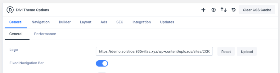
Scrolling to the bottom of the same tab, you will see all the custom CSS section which is associated with the theme by default. This will need to be edited in small places later on for third-party plugins used, and any extra you may wish to add if you are an advanced user.

The Integration tab in Divi Theme Options is where you will find fields for adding scripts or tracking codes such as google analytics or Facebook pixels.
Divi Visual Builder Overview
The Divi Visual Builder is used to create the content for pages in a live front-end-view editor. This is used for all pages listed in the Pages menu and for page templates we have prepared in the Theme Builder.
Let the page content load fully, it may take a few seconds to render our Guestwisely plugin modules.
Please note: Some modules that are linked to the property API may display differently (or not at all) to the front-end live site.
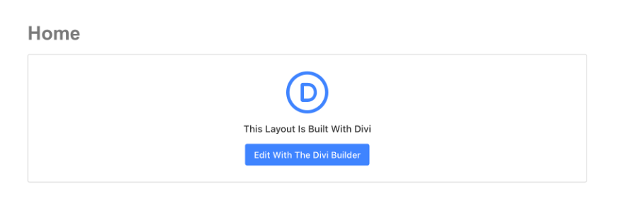
To enter the Visual Builder we must go to Pages Menu > Select Page > Edit With the Divi Builder.
Visual Builder Interface
The Visual Builder interface has three key areas you’ll use all the time: left sidebar, top bar, and right settings panel.
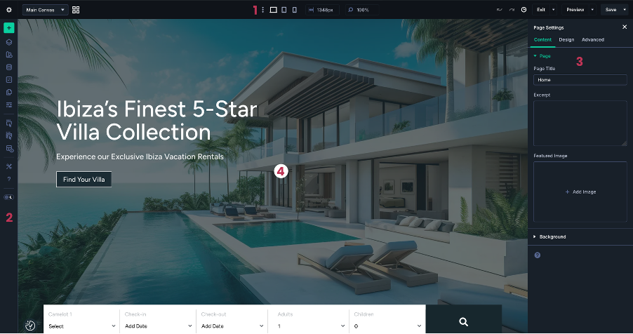
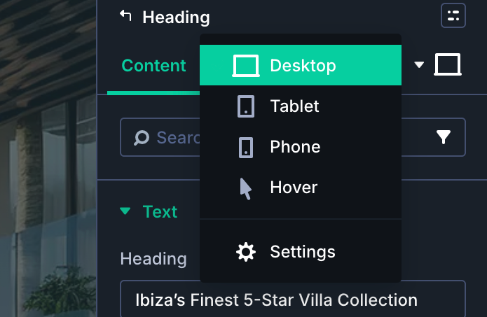
Top Bar – Page tools and responsive controls: This bar controls device previews (desktop, tablet, phone), canvas width, zoom, history, page preview and saving.
Left Sidebar Panel – Builder tools: This is where you access layouts, structure tools, builder settings, and help.
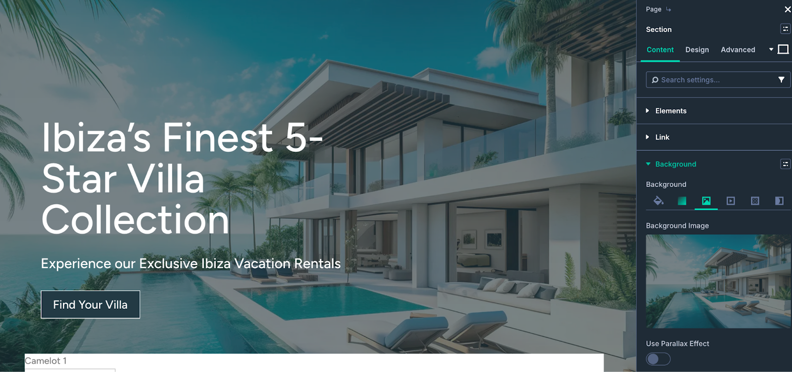
Right Sidebar – Settings panel: When you click any Section, Row, Column, or Module, its settings open here. You’ll see Content, Design, and Advanced tabs for that element.
Visual Builder Canvas: In the center of the screen, you have the canvas, where you actually see and edit your layout.
Topbar
The top bar controls your view, responsive editing, and page state. Common items you’ll use:
Off-Page Canvases: Used to access the design of popups assigned to the page
Device icons (breakpoints): Switch between Desktop, Tablet, and Phone previews.
History and undo/redo:
Undo/redo arrows let you step back and forward through recent actions.
The history icon opens the full History panel, where you can jump to a specific state.
Save / Exit / Preview
Use Save regularly.
Use Preview to see the page in a new tab without the Visual Builder interface.
Use the Exit button when you’re done editing to return to the normal page view or dashboard.
Left Sidebar
The left sidebar controls how the Visual Builder interface behaves and gives you quick access to key tools.
Common items you’ll use:
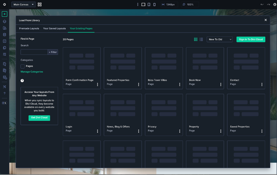
Add Layout
Insert saved layouts/modules from your Divi Library
Useful when you want to start from a premade design instead of a blank page.
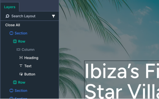
Layers View
Opens the Layers panel, a tree view of your Sections, Rows, Columns, and Modules.
Great for selecting elements in crowded layouts, renaming items, and reorganizing the page structure.
Inspector: Displays the styles and content that the selected page section or element has.
Global Variable Manager: It allows you to create/change global variables such as Text, Color, Fonts, and more.
Wireframe View: Switches the canvas to Wireframe mode, where each Section/Row/Module appears as a simple labeled block.
Right Settings Panel
Whenever you click a Section, Row, Column, or Module, the right sidebar opens its settings.
At the top:
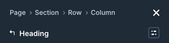
Breadcrumbs
Shows where you are in the layout structure (for example: Page → Section → Row → Column → Module).
You can click each part to jump back up the structure.
Inside the panel:
Content tab
Actual content: text, images, icons, links.
Backgrounds and labels (for easier identification in Layers).
Design tab
Styling: fonts, sizes, spacing, colors, borders, shadows, alignment, etc.
Many options support responsive values and hover states directly inside the field.
Advanced tab
Fine control: custom CSS, visibility, transitions, attributes, and more.
Useful once you’re comfortable with the basics and want more control.
Responsive / hover toggles
Device icons let you set different values at different breakpoints.
Hover icons let you style “normal” and “hover” states in the same place.
For a more extensive guide on the Divi 5 Visual Builder, see the official support guide centre here.
Was this article helpful?
That’s Great!
Thank you for your feedback
Sorry! We couldn't be helpful
Thank you for your feedback
Feedback sent
We appreciate your effort and will try to fix the article