Introduction
The live view of the page content is constructed using various colour-coded frames:
Hovering over each page element indicates which section you can directly click on for editing in the right-hand-side panel. To be sure you are selecting the correct element, click the settings cog icon which appear in the toolbar for each hovered element.
Divi Standard Modules
Lets take a look at some of the common (grey)modules available for customization:
Text Module
Each text module is pulling through the fonts we set at a top-level in the WordPress Customizer, which we have set up with suitable sizes for all devices following the steps:
1. Clicking the text module will immediately bring up a text editor in the right side panel settings.
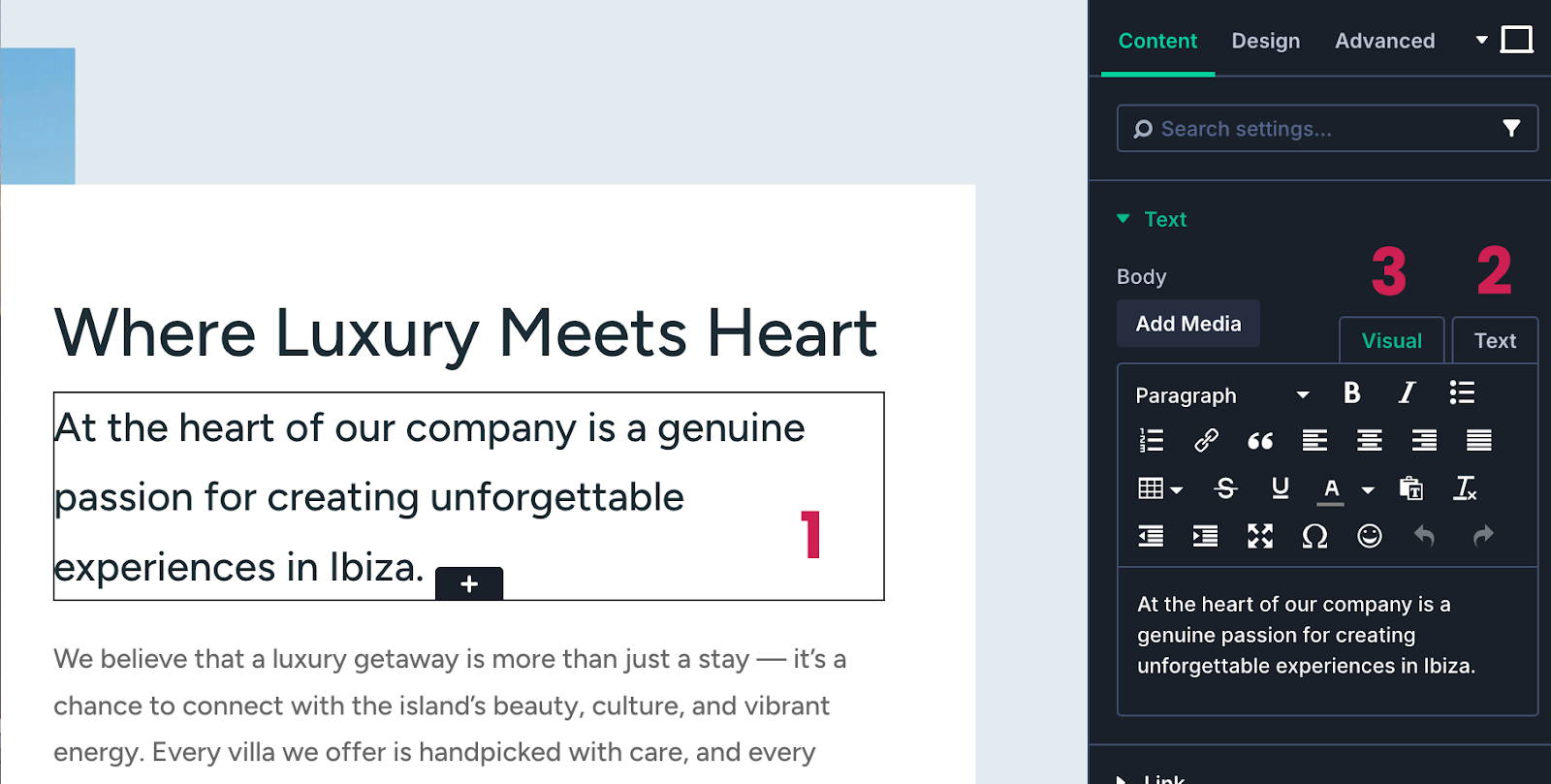
2&3. The editor has 2 sub-tabs Visual and Text. Visual will give you a representation of the final output, previewing size and weight of font.
If you are pasting text content into this area from elsewhere eg. another website or word document, you should first copy it into a plain text editor https://www.onlinetexteditor.com/ to strip out any styles that it may be holding.
The Text tab is for more advanced users as it displays the code that is styling the font.
Image Module/Backgrounds
There are 2 methods to adding/editing images on your website. You can use the Image module which simple allows you to select an image from the media library in the right settings panel. Or you can give a section or column a background image which fills the container.
1. Select the required section containing the placeholder photo.
2. In the section settings, in the first content tab scroll down to
3 Background Image
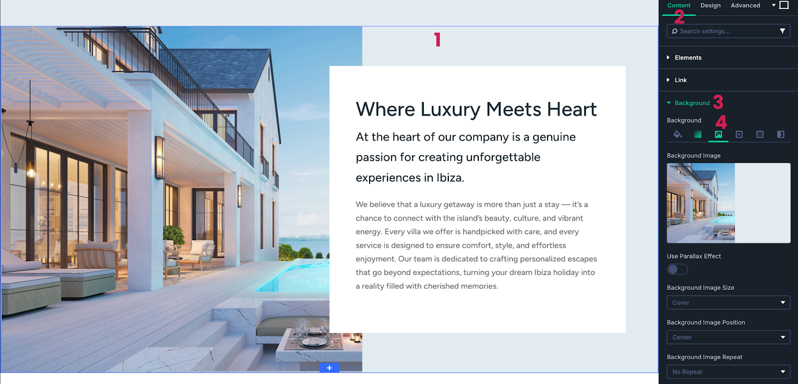
4. In the Image tab, click the thumbnail image, and choose/replace your new image.
It is highly recommended you optimise your photos for web resolution so it doesn’t have a negative impact on your page loading speeds. WordPress will reduce super-large images to an extent but there are plugins available that will compress files to a minimum.
IMPORTANT: ALL STOCK PHOTOS ON THE DEMO SITE MUST BE REPLACED BY YOUR OWN PHOTOGRAPHY OR STOCK IMAGES YOU HAVE PURCHASED A LICENCE FOR.
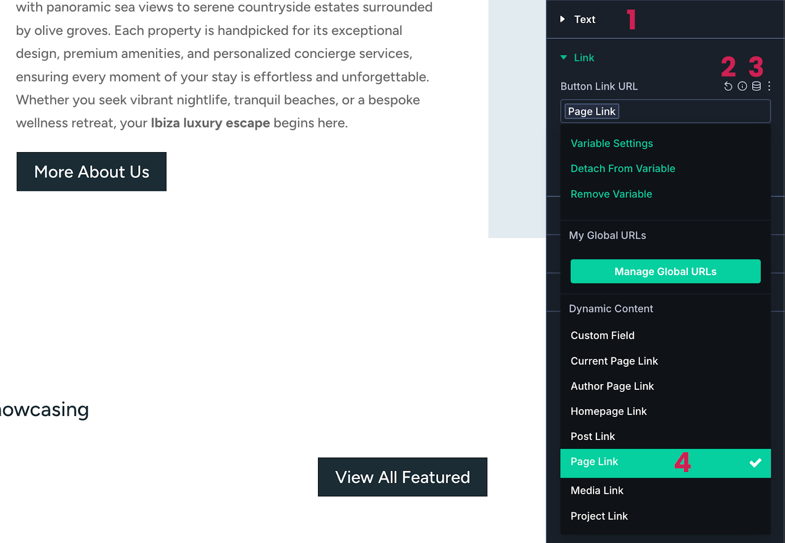
Button Module
All the styles for buttons were previously set up in the Theme Customizer so unless you need to overwrite the styles (in Design tab) this is just a case of updating the button text and link, if needed. Most page buttons are currently using dynamic page links which may need editing.
1. Update the button display text.
2. If you require an outward link, click arrow icon to delete the dynamic link and then paste in your url to the link field.
3. Or to edit the dynamic page link (you can hover over it to see what page it is currently set to) simply click ‘Page Link’ in the link field.
4. Scroll down to ‘Page Link’ again then select the required page from dropdown.
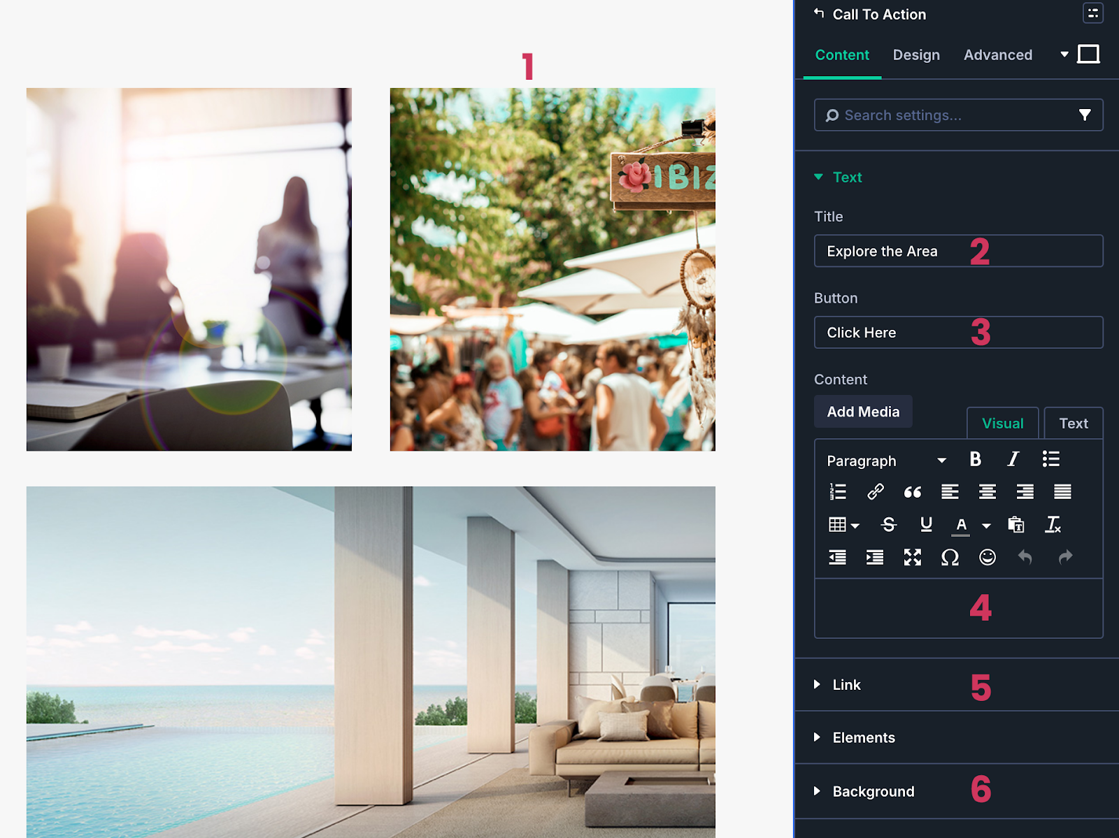
Call to Action Module
Call to Action modules offer a combination of title, description and button. Azure theme uses these regularly for sections that have text on mouse-over so the default states of the elements are set to invisible. But if you click on the module you will see in the right side panel all the text fields are displaying placeholder content for you to customise.
1. Click directly on the module and you will see the settings panel appear.
2. Edit your title
3. Edit button display text if required
4. Add description text too if required
5. Edit button link (either manually or using dynamic link as per the button module)
6. Replace the background image from your media library
Blurb Module
The Blurb module is a combination of Image/icon, Title, and Description (text editor) then scroll down to Image & Icon menu to change your image from the media library.

IMPORTANT: ALL STOCK PHOTOS ON THE DEMO SITE MUST BE REPLACED BY YOUR OWN PHOTOGRAPHY OR STOCK IMAGES YOU HAVE PURCHASED A LICENCE FOR.
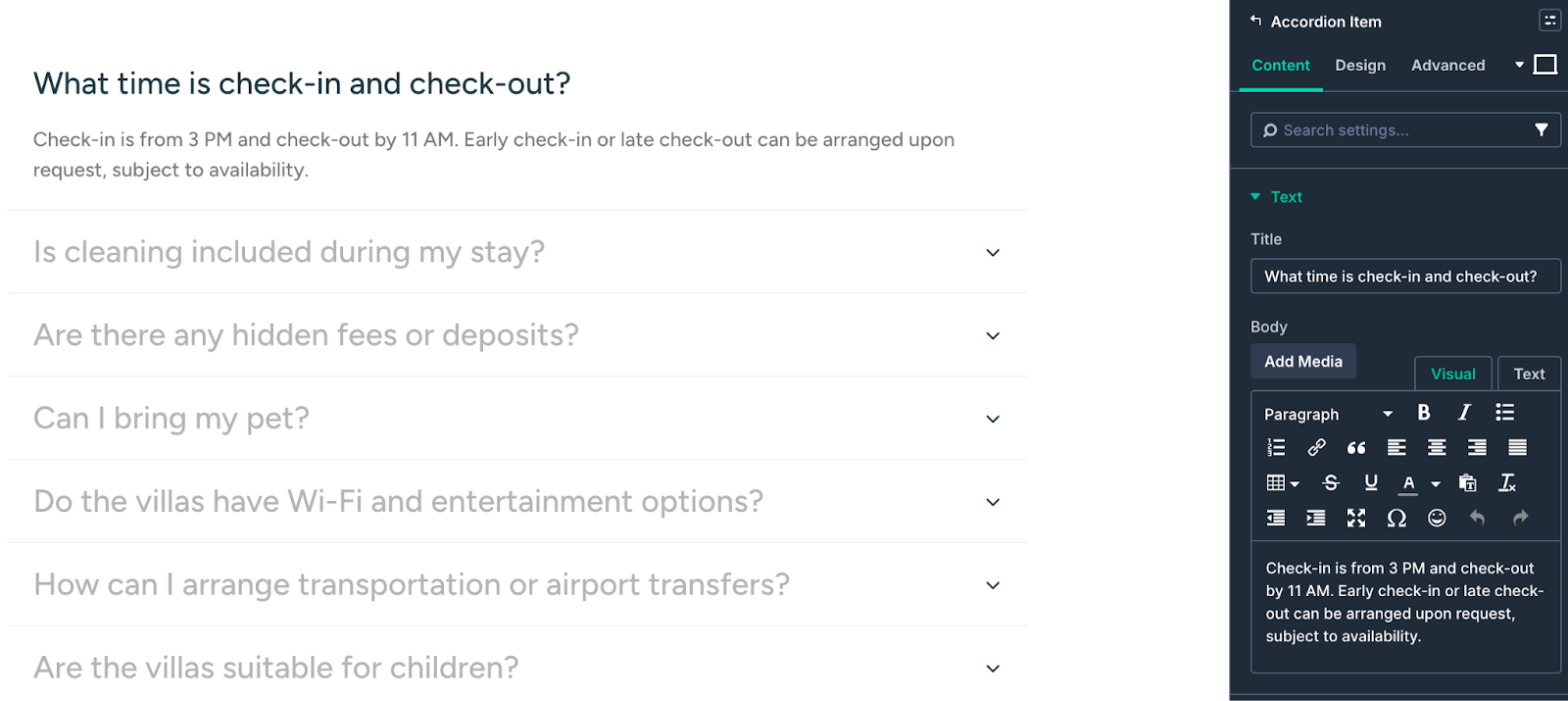
Accordion Module
Accordion and Toggle modules have very similar settings, the only difference is that accordions can reveal only one contents at one time – perfect for your FAQs page. Simply click on a title of your accordion item and the question and answer fields will display in the right side panel.
For a full list of Divi modules and descriptions visit here.
Divi Custom Modules
Some elements in Aurora Theme have been custom created using a combination of various modules. Here is a quick guide in to editing them.
Looped Blog Group
Instead of using the standard blog module, the latest news, blogs and offers grids have been custom built with Divi Loop Builder to a create a custom design for Azure Theme.
The Divi Loop function uses the layout created in column 1 (a group of modules)and duplicates it for all assigned posts in a grid. So if any changes are required they only need to be applied in the first column group which you can select elements freely with the cursor.
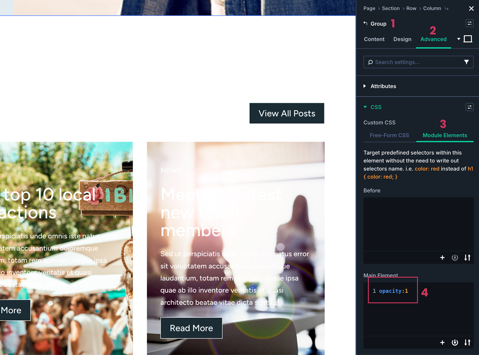
Homepage Latest Posts
In the visual builder you will notice these have empty content. This is because the default state of the content is hidden and then appears on mouse-over on the front end.
If you wish to make edits to the blog post template, then we would recommend clicking on the first post (click top corner then check in the right settings panel that ‘Group’ is selected. Then head to Advanced tab > CSS > Module Elements > main Element and change the opacity value to ‘1’. This will make all visible while you edit and you can change it back to 0 when complete.
News Page
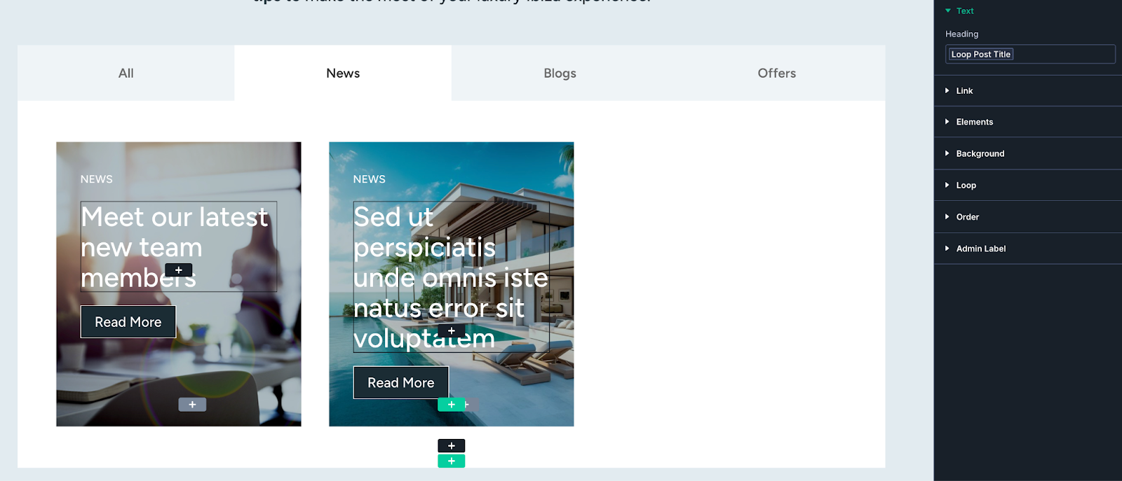
The News page uses a Tab module which acts as a filter for selecting categrorized posts. Each tab has the same type of post grid as the homepage but they are each configured to display just 1 category - or all categories in tab 1.
After selecting the top level tab module, you can then freely switch the tabs in the builder, and if you wish to make edits to the looped column 1 group, all is visible and editable to do so.
Group Carousel (Team Slider)
Below the first 2 team members on the team page, there are multiple carousels set up for various departments. This uses the Group Carousel Module which contains a combination of standard modules image, heading and text modules).
Unlike the Blog Grid, these are not looped content and can each be potentially formatted differently per team member. The components are accessible directly through the visual builder - but if you need to add more team members or edit ones out of sight, the easiest suggestion is to first select the whole module from the bottom of the grey container (see below).
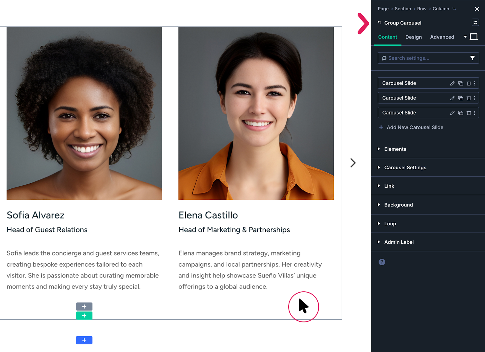
If selected correctly it will be indicated at the top of the right settings panel as Group Carousel. Below this you will see the three placeholder team members (each a carousel slide). You can duplicate or edit these by clicking the action icons, and the current slide will display in the page builder.
Tip: If you select the whole module from the bottom of the grey container, you can then use the slider arrows to navigate to a team member that needs editing.
Was this article helpful?
That’s Great!
Thank you for your feedback
Sorry! We couldn't be helpful
Thank you for your feedback
Feedback sent
We appreciate your effort and will try to fix the article